Part 3: 1980s Home Brew – The Games… Carl Muller shares his remembrance of home coding
[ Comments are closed for this post ]
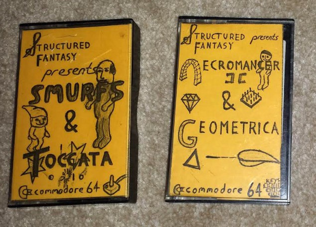
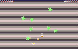
In Part 3 Carl tells us about designing his games from making his own Smurf platformer based on a screenshot of a Colecovision Smurf game he saw published in a magazine to experimenting in sound for “Toccato”. It was a time for experimentation in what could be achieved on a micro and looking at screenshots in magazines was also the inspiration for the isometric graphics of “Necromancer][“ his own explorations led to the development of ways to play outside the border used in “Geometrica”.
Smurfs
As a teenager I loved the 1980s animated TV series Smurfs, based on the adorable 1950s comic characters. When I got a Commodore 64 I thought “with the power of sprites, surely I could create a game based on Smurfs?” and so for three months in early 1985 I tried to prove to myself that I could.
Hardware sprites are a feature that allows two dimensional objects to move smoothly across the screen without the game performing lots of slow calculations. I had tried to implement them in software on the VIC-20 (in a game I called Jungler) but with mixed success. Hardware sprites made displaying an object as simple as setting four registers – horizontal position, vertical position, image index and attributes. This is the same today on the embedded TV games hardware I currently write games on, and it is a great help for performance.
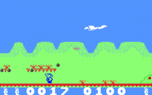
I had seen a screen-shot of the 1982 Colecovision game “Smurf: Rescue in Gargamel’s Castle” in a magazine, and was amazed at the graphics. I was inspired by it, and you can see that now as the plot is the same (rescue Smurfette from Gargamel’s castle) and the first and last screens have similar theming (the Smurf village and Gargamel’s castle), despite my poorly executed “programmers graphics”. However I have tonight looked at a youtube video of the game-play and can see they are somewhat different, despite both being platform games (or as the Germans call them “run and jump”), since my one includes scrolling sections as well as the flip screen areas. Bear in mind that I did not see the definitive scrolling platform game “Super Mario Brothers” until 1989, so the games I were comparing it to in my mind were ones like “Hunchback” from Ocean software, which were less technically impressive, and possibly the wonderful 1984 Activision game “Pitfall 2”, although I may not have seen that before writing “Smurfs”.
In those times of rampant piracy and innocence of the intellectual property law, I had not even considered the implications of creating an unlicensed game based on high profile characters. A couple of years later I would think about it when writing to the creator of the television show “Terry Teo” but he must have been disappointed when he found out the person enquiring about the game rights to his characters was a teenage school-kid.
The game was written in three distinct stages, each taking a month to design and implement, which correspond to the three game engines. For each stage, I wrote a separate program to enter the code and data into memory and run it. These days I just have the final result of that, where the results of the three programs were merged into one image. The current game image was compressed in the early 1990s when I transferred the game from 5.25 inch floppy disks to PC.
For each game engine, I wrote the game in machine code as numbers within data statements, corresponding to a machine code program. My notebooks (which I appear to have misplaced) had the memory addresses of specific variables (such as the number of lives) and of function names. Since the machine code had functions baked into “absolute” (unchanging) addresses, if I wanted to alter a function after I had written it, I would have to add the new function at the end of the code, and get the old function to call it instead. I have to say, this is not how I would write it today!
For the graphics, I had graph paper maths notebooks, and I would draw the graphics on these notebooks by colouring in dots within a pattern. When I was happy with the graphic, I would turn it into numbers by adding up the values of each pixel (for example 128 or 32) and writing the result next to the graphic, and in the program. These days this is something you would use a computer art package for: even writing the data in hexadecimal (base 16) would be easier than in decimal.
The three stages were: a side-scrolling jumping game, set outdoors from the Smurf village to the castle. A climbing game set on the wall of the castle. And a flip screen stage of 8 locations within the castle itself, featuring bats, spiders, Azreal the cat and Gargamel the wizard as enemies.
For the first jumping game, the screen would scroll from left to right and the player had the option of moving left, moving right, jumping, or speeding up the scroll (which seems a strange control to have). You controlled a Smurf strolling past smurfberry bushes, and had to jump over thistles and avoid the eggs dropped down on you by a passing seagull (not quite sure why it was a seagull not a raven like in the Colecovision game. Possibly I was inspired by the bird in the “Crazy Climber” arcade game). There was a split-screen effect (a “raster interrupt”) on this level to try to get the border colour to match the blue of the sky and the green of the bushes.
The background was stored as a series of horizontal offsets of bushes and thistles, so was quite compact.
For the second section, the screen would scroll vertically. I initially tried to make this smooth scrolling, but a glitch occurred whereby the screen borders would disappear. I would use this effect deliberately in the subsequent game “Geometrica” but resolved it in Smurfs by scrolling the screen on a character (8 pixel) basis instead of pixel by pixel. The background was again stored as a series of positions and lengths of vines and platforms, rather than as a grid of tiles (which would be a more straightforward way of designing a rich game level).
The third section is a series of jumping challenges as flip screens. I note that if you move left while you are on the window ledge, you will actually fall back down the entire second stage! This stage is most similar to that of “Hunchback” or now it seems the original Turtles game.
In the final screen, Smurfette is actually your Smurf character with an additional yellow sprite for her golden hair. This has subsequently led to colleagues accusing me of making Smurfette a drag-queen! This was not how I saw her at the time, I was just saving on time redrawing graphics!
Necromancer ][
The British game developer Ultimate Play the Game, now known as Rare, astonished the world in 1984 when they released the game “Knight Lore” on the ZX Spectrum, which featured “isometric” graphics. This style of drawing was well known (along with “oblique” and “perspective”) from school classes many kiwi boys did called “Technical Drawing”, which is now part of “Visual Communication Design”, but few games had used it – most notably some arcade games (“Zaxxon”, “Q-bert”, “Congo Bongo”, “Marble Madness”).
When “Knight Lore” came out, it had a galvanising effect on the games scene, and many games with a similar viewpoint came out afterwards. Just looking at screen-shots of it in magazines inspired me to create two games with a similar style.
My first of these games, called “The Necromancer’s Realm” was mostly written in BASIC, with a few machine code subroutines for speed. It was published in the December 1985 issue of “Computer and Video Games”, who sent me a cheque for £25. This required some help to get cashed, but was very welcome! It was written earlier that year, after “Smurfs”. It had a large, sparse map, with only a few enemies in it (wizard, bird, and “boomer” who looks like an orange Golem). I think the weapons might only work on specific enemies (club on boomer, catapult on bird). Part of the map spells out words, if you look from high enough – this was inspired by a situation in the Narnia book “The Silver Chair”.
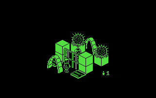
That game didn’t have any objects in front of the player, and used sprites in front of simple static backgrounds. For the sequel I tried to get the full isometric effect by plotting objects in front of each other. To do this, I plotted all the graphics in software. I tried to get it to run on the VIC-20 as well as the C64. I am now unsure whether I actually succeeded – the current version does not run on the VIC-20 as is, but the version on the tape had an additional loader program which allowed the player to change the keys used and performed some setup operations, so perhaps it did work.
To achieve both these goals, the screen was set up as a simple monochrome bitmap of 128 * 128 pixels, made up of a 16 * 16 grid of custom characters. The graphics were drawn using the “painters algorithm”, i.e. drawing the graphics (roughly) from the back to the front. The objects could move up and down by individual pixels, but left and right only in 8 pixel increments.
The game was written completely in machine-code, apart from the small setup routine at the beginning.
The idea was to collect three different objects from around the map (from the cover illustration they are a sock, diamond and bottle) and drop them in a treasure chamber (near the top of the map). Once you did that, something special happened. You could also pick up spare lives (little Oscar-like statues). I think one of the puzzles involved you dropping a spare life (a statue) to give yourself some extra height so you could make a certain jump! You could only hold one object at a time, so completing the game would involve some backtracking.
What was this special thing at the end? A text adventure! At the time, interactive fiction was still mainstream – this was the era of “Choose your own adventure” books, and games such as “The Hobbit”, which involved you typing instructions to the computer in and getting a text response.
I admit it is a bit of a strange combination though! I have not got through to the text adventure in years, so cannot offer advice beyond the usual commands that such games had: “n,s,e,w” for movement; perhaps “i” for inventory or “help” might be implemented.
Geometrica
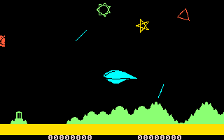
The discovery of the sprites in the border technique while I was making the second section of “Smurfs” eventually led to a game of its own. This was a shoot-em-up where you controlled a spaceship that could move left and right over a scrolling landscape, and also up and down (this decelerated your craft).
In this game the top and bottom border of the screen were disabled so that player and enemy sprites could roam over a larger area – on PAL televisions such as we had in New Zealand, anyway.
The way it works is by setting the screen to display 25 rows of text, then after it has displayed 24.5 of them setting it to display 24! The video chip never reaches what it thinks is the bottom row of text, so it does not terminate the display. Sprites are displayed as normal but the background comes from a static area of memory.
I had not seen this effect mentioned anywhere before, so I sent a (paper) letter to people I had read about (such as Jeff Minter and Tony Crowther I think) telling them about the effect. No doubt with their access to Compunet they had already heard of this, but perhaps this was an early demo of the effect.
The sprites are simple rotated geometrical shapes, which I wrote a program to generate.
Toccata
This game was mostly due to an interest in music leading me to want to improve the sound of my games. The tune is taken from a music piece I had from my piano lessons. It used the subtractive filter the C64 was famous for, and also notorious, since there were slight variations between models of the computer.
A simple space shoot-em-up where you controlled a ship at the bottom of the screen, shooting enemies that came on in mathematical patterns. The enemies were sprites but their bullets were plotted in software.
After you die, there is a demonstration of an unusual sprite effect where the blue text is behind some green sprites but in front of the white circle, but the white circle is in front of the green sprites! You could move this sprite mask left and right to look at the effect. I wonder if all emulators display this correctly.

![Necromancer][crop](../wp-content/uploads/cache/Necromancercrop/3483483428.jpg)
